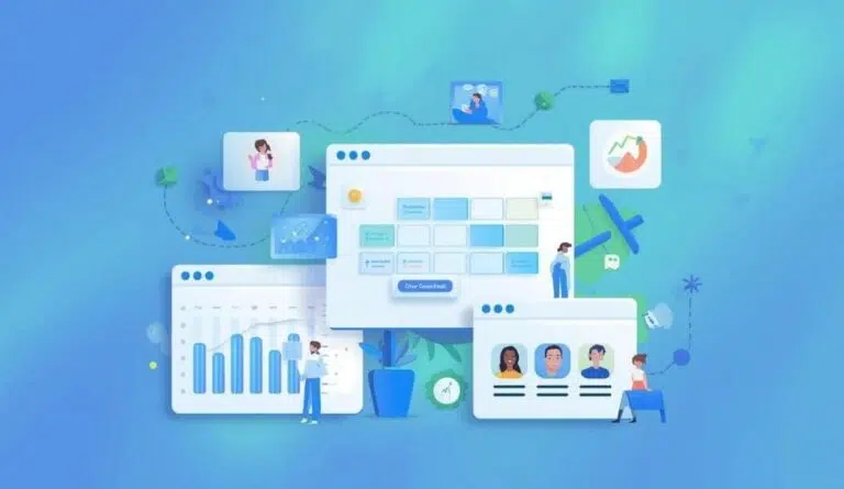

Your eCommerce store isn’t just a website. Think of it as your virtual storefront, introducing customers to your brand and products. Get the basics like website structure wrong and risk losing loyal customers and increasing revenue.
It’s a scary thought, isn’t it? Knowing that clunky navigation or confusing structure can affect your online presence. The good news? You can fix it. And it starts with a well-structured website hierarchy.
We’ll explain how below.
What is Website Hierarchy?
Website hierarchy refers to the arrangement of pages and content in a structured manner, typically resembling a pyramid.
Imagine the hierarchy as a tree. At the top, you’ve got your homepage, followed by category pages and then subcategories or product pages underneath.
A clear hierarchy helps visitors quickly find what they need without frustration. It’s the difference between a smooth shopping spree and a rage-clicking session that ends in a bounce.
How Website Hierarchy Helps Engagement
One of the biggest turn-offs for users is a site that’s hard to navigate.
These days, you can create your customized website or online store using an AI website builder. Because of the builder’s perceptive AI tools, your website is developed according to your prompts.
Once you’ve familiarized yourself with website hierarchy best practices, you can input your cues.
According to Hocoos, an AI store builder is the fastest and simplest way to create an eCommerce website for your business.
A well-structured hierarchy helps users quickly find what they need, encouraging them to stay longer, explore more, and make a purchase.
Three Common Website Structures
Linear
With this layout, visitors move forward only when they’re ready. They start on the homepage, go into more details on the next page, and then take action.
Each step builds on the last, keeping things simple and focused. A linear navigation structure is ideal for highlighting a brand, product, or service without overwhelming people with too much content.
Hierarchical
Remember we spoke about the tree? This is it in website design. The structure uses a top-down approach to help visitors navigate your site.
It starts with a broad page, like the homepage, and branches out to more specific content. The main pages are the “parent” and the more detailed ones, as “child” or subpages.
Webbed
The webbed model gets its name from its net-like design. Instead of following a strict order or hierarchy, every page is connected through internal links, like a spider web.
No matter where you are on the site, you can jump to any other page with just a click.
Which Website Structure is Right for Me?

Your audience determines your website’s hierarchy or structure. It is governed by three factors – goals, content needs, and the user journey.
- Goals: Website structure should depend on what it’s about and what you want it to do.
- Content: Consider the kind and amount of content you’ll share on your site. Different layouts work better depending on how and where you place content.
- User journey: Websites are built for people, so it’s important to think about how your visitors will use and experience the site.
Why Website Hierarchy Matters
A well-thought-out website hierarchy can attract a loyal customer base. Well, be prepared to have your mind blown.
Great SEO (Search Engine Optimization) attracts customers. A clear hierarchy helps search engines like Google crawl and index your pages more efficiently.
This leads to better rankings, more organic traffic, and more opportunities to engage shoppers.
Even during a redesign, optimizing site structure can significantly impact how search engines view and rank your website. Bonus: A better structure can also reduce page load times.
Business coach Robin Waite highlights how intelligent web design elements like visual cues, layout, and user flows can influence behavior. A smart hierarchy encourages exploration, not exit.
How to Optimize Website Hierarchy
Clean and Simple
Keep labels simple and user-friendly. Break your products into well-defined categories. If you sell clothing, don’t lump everything into “Men” and “Women.” Go deeper. Think “Tops,” “Bottoms,” “Shoes,” etc.
Breadcrumbing
Breadcrumbs are a great way to keep users oriented. They show the path someone’s taken through your site, like: Home > Women > Shoes > Running. This not only aids navigation but gives users a mental map of your site’s structure.
Mobile First
More than half of online shopping is now done on smartphones. A hierarchy that doesn’t translate well to mobile isn’t good for business.
Use collapsible menus and intuitive icons, and make sure everything is tappable and scroll-friendly. TechRadar notes that designing mobile-first ensures users can engage no matter the device.
Optimize for People, Not Bots
Some site owners focus more on pleasing the bots than the actual users. While it’s not bad to keep SEO in mind, don’t forget your main goal is to keep real people engaged.
Balance Link Interaction
What’s the magic number? This has been a hot topic in the SEO world for a while. A good rule of thumb is to include about three to five links for every 1,000 words of content.
Heading Hierarchy
Using a clear heading hierarchy is a simple way to organize your content so it makes sense to both people and search engines. Headings like H1, H2, H3, and so on help break things up and show the flow of information.
Even Google’s John Mueller agrees and confirms that using a clear heading hierarchy on your pages is incredibly beneficial. It makes your content easier to understand for both users and search engines.
Click Depth
No matter your site type, users should be able to find what they need with as few clicks as possible. While no strict rules apply, aim to keep important content within four clicks from the homepage.
URL Structure
Easy-to-read URLs help people quickly understand what they’re clicking on. From a search engine’s point of view, descriptive URLs also make it less complicated to crawl your site and can improve click-through rates.
A solid URL structure improves the user experience and boosts your search rankings, making your content easier to find and more likely to get clicked.
Prime Real Estate

Back to the significance of your homepage. This page and top navigation are prime real estate and should showcase your most valuable categories, promotions, and entry points.
A well-designed homepage sets the tone for the whole experience, making it simple for people to find what matters most and encouraging them to explore more. It’s crucial in shaping first impressions and driving engagement from the start.
Avoid overwhelming users with too many options. Instead, keep it clean and focused. Simplifying navigation and providing visual consistency across categories can significantly boost engagement rates.
Visual hierarchy uses font sizes, colors, spacing, and images to highlight what’s important. That’s why your call-to-action (CTA) buttons must pop. The same applies to featured products? They should catch the eye immediately.
Sidestep the Following…
Your first impulse is to make your website a visual work of art. However, Forbes explains that overengineering your site is the worst thing you can do.
In some cases, less is undoubtedly more. Visually striking designs aligned with unique content are fantastic but avoid overcomplicating things.
At its core, a website is meant to connect you with your customers. So, when designing your website, clearly show who you are, what you do, and how people can get in touch.
That’s what grabs the attention of potential customers and keeps them interested.
Final Takes
A flashy website is cool but none of the aesthetics matter if users can’t find their way around. Website hierarchy isn’t just about neat menus, it’s about creating a guided experience that leads customers from curiosity to checkout.
Don’t make users dig through layers of menus to find what they need. Keep similar items grouped logically. Use filters and tags on product listings to make sorting easy. Don’t forget to link related pages, it encourages them to stick around and explore.
Small changes like high-contrast colors, larger text, or making your site work well with screen readers can make a big difference. These tweaks can decide whether someone can use your site… and whether they stick around to become a loyal customer.
Final, Final Take
Whether you’re redesigning or building your store with an AI website builder, investing in a clean structure is one of the best ways to keep customers engaged.
An AI site builder is best suited for business owners who have no prior experience in website building. Some offer free domains, WordPress websites, and a site editor.
Start with the blueprint. In the world of e-commerce, the path you create for your customers is as important as the products you sell. Keep this in mind, along with the above points, when fleshing out the foundation.
By following best practices on website hierarchy, you’ll be well on your way to business success and happy, loyal customers.